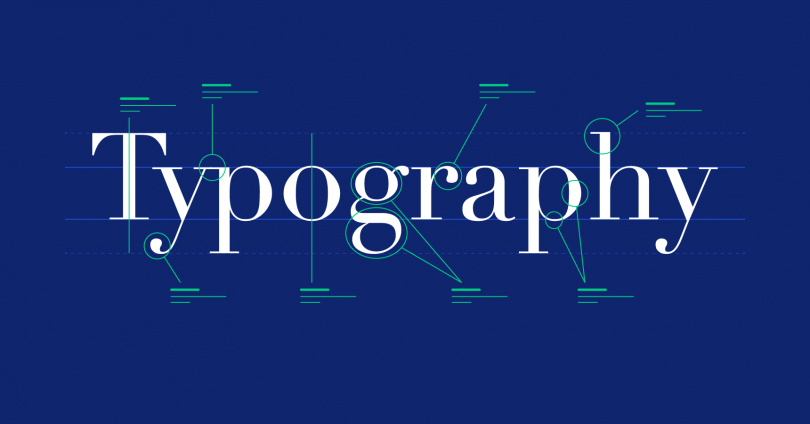
Typeface and fonts are the characteristics, and the styling of letterings, different typeface means different fonts for each alphabet and numbering, different weight, different height, and size of each letter. However, many people don’t know that each of the fonts and typeface might influence how you read and essentially affect your learning from it.
From the best Sans Serif font, best typeface, and proper fonts for your article, fonts and typeface are important not just to give your article more credibility, but also to give a proper sense of style, and make sure your readers take you seriously.
If you like our article here, you might also like our articles on font selections, the study of fonts, and also our recommendations for fonts. You can also see and download our collections of fonts, from the best Sans Serif font to the recommended fonts for newspapers and to your articles. Font selections and size matter, and if you want to make your reader enjoy your article and take your writing seriously, always take good fonts.
The effects of font choice on the learning process
While most people won’t mind learning or reading books with any random fonts, some people won’t take the reading seriously when the fonts aren’t properly used. For example, how can you take a book about mechanical engineering seriously when it is written with Comic sans, comical fonts used for children’s books, and funny notice.
The choice for each fonts matter, as it can affect the serious tone of each learning, giving better credibility to the research reports, and giving better learning experiences. To discuss more how the fonts can affect the learning process, and learning experiences, here are a few notable points regarding the use of fonts for the learning articles.
Fonts and Typeface influence reading engagement
Fonts will give personality and style to the website, books, or body of the text. Fonts subliminally provoke and influence the reading engagement, provoking emotional responses of the readers, and affecting how we perceive the content. How we perceive the contents, be its clean, elegant, crisp, modern style, cluttered writing, chaotic, or outdated styles.
Initial emotional responses will also determine the readers reading engagement, affecting learners with direct engagement, and with consent. Essentially, online readers engage more with content on the website, if it was presented with fonts or typeface that they prefer.
Fonts will also determine the readability, legibility, and organization of content
For practical reasons, fonts and typeface will determine the books, website, or body of text’s readability, legibility, and also the organization of each content. It influences the organization of the online text, how it is readable, and also the legibility of each text.
Readability refers to how easy the body of the text is to read, the Legibility measures how you can easily distinguish each letter, from other particularly similar fonts. It is also to measure how legit the text can be, and how professional it was created. As for the organization of content, it influences how well the writers organize the articles into online content on/her website.
For example, when reading research notes, compiled by a professional professor, you would expect them to write them in professional standardized fonts such as Times New Roman, Arial, or Helvetica. It is used as professional font, due to its high readability, and legitimacy of each font, while also an easy content organization for this type of font.
It affects the credulity of articles, books, or research note
When you are reading an online article, the readers might sometime adopt a behavior when reading, such as believing something; doing certain things, and considering things used in the writing article, such as using the best Sans Serif font in the article.
More or less, certain fonts have powerful value, and we perceive them as more credulity, and more professional, compared with other fonts. So, if you want to inform your reader, and make sure your reader will get your point seriously, always use a professional serious tone, and use proper fonts.
Some of the most serious fonts will have a more authoritative presence when used in the article, for example, professional fonts such as Sans serif, times new roman, and Arial, while other fonts like the customized, and strange fonts like the Comic sans will be used as playful tone, mostly for children’s readings, or some internet meme.
That’s it from our article regarding the influence of fonts on learning. If you want to create a more impactful learning article, and to make your readers take your writing seriously, obviously you can’t use fonts like comic sans, so you would need some of the best Sans Serif fonts and also proper, more professional fonts to use in your learning article. See our guide and official website to learn more about this.

